Sau khi đã tìm hiểu xong bài tạo chuyển động animation trong CSS3 thì bài này mình sẽ áp dụng nó vào việc code một button animation theo kiểu rắn ăn mồi cho mọi người cùng ôn lại luôn.
1. Tạo khung HTML.
Đầu tiên mình sẽ tạo khung HTML và các thẻ cần thiết.
<!doctype html>
<html lang="en">
<head>
    <meta charset="UTF-8">
    <meta name="viewport"
          content="width=device-width, user-scalable=no, initial-scale=1.0, maximum-scale=1.0, minimum-scale=1.0">
    <meta http-equiv="X-UA-Compatible" content="ie=edge">
    <title>Toidicode.com - Create button animation</title>
    <style>

    </style>
</head>
<body>
<a href="#">
    <span></span>
    <span></span>
    <span></span>
    <span></span>
    Button
</a>
</body>
</html>
2. CSS cơ bản cho button.
Sau khi đã HTML khung cơ bản xong, tiếp tục mình sẽ CSS cho thẻ a ở giữa màn hình và background tối màu cho mọi người dễ nhìn.
body {
    padding: 0;
    margin: 0;
    background-color: #787878;
}

a {
    position: absolute;
    left: 50%;
    top: 50%;
    transform: translate(-50%, -50%);
    background-color: #000000;
    padding: 20px 40px;
    text-decoration: none;
    color: white;
    text-transform: uppercase;
    box-shadow: 0 1px 3px .4px #000000;
    transition: all 0.3s;
}

a:hover {
    box-shadow: 0 1px 7px .4px #000000;
    color: red;
}
3. CSS border cho button.
Tiếp tục chúng ta sẽ css cho 4 thẻ span bên trong thẻ a thành border.
/*TOP*/
a span:nth-child(1) {
    content: '';
    position: absolute;
    width: 100%;
    height: 3px;
    background: red;
    top: 0;
    right: 0;

}

/*Right*/
a span:nth-child(2) {
    content: '';
    position: absolute;
    width: 3px;
    height: 100%;
    background: red;
    top: 0;
    right: 0;
}

/*Bottom*/
a span:nth-child(3) {
    content: '';
    position: absolute;
    width: 100%;
    height: 3px;
    background: red;
    bottom: 0;
    right: 0;
}

/*Left*/
a span:nth-child(4) {
    content: '';
    position: absolute;
    width: 3px;
    height: 100%;
    background: red;
    top: 0;
    left: 0;
}
Tiếp theo đó chúng ta sẽ gradient màu sắc cho 4 thẻ span.
/*TOP*/
a span:nth-child(1) {
    content: '';
    position: absolute;
    width: 100%;
    height: 3px;
    background: red linear-gradient(to right, black, red);
    top: 0;
    right: 0;

}

/*Right*/
a span:nth-child(2) {
    content: '';
    position: absolute;
    width: 3px;
    height: 100%;
    background: red linear-gradient(to bottom, black, red);
    top: 0;
    right: 0;
}

/*Bottom*/
a span:nth-child(3) {
    content: '';
    position: absolute;
    width: 100%;
    height: 3px;
    background: red linear-gradient(to left, black, red);
    bottom: 0;
    right: 0;
}

/*Left*/
a span:nth-child(4) {
    content: '';
    position: absolute;
    width: 3px;
    height: 100%;
    background: red linear-gradient(to top, black, red);
    top: 0;
    left: 0;

}
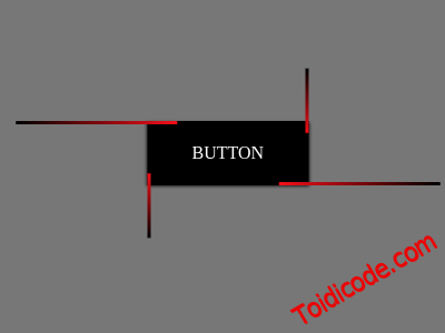
Giờ lom đã có vẻ đẹp hơn một chút rồi đó
4, Tạo chuyển động - animation.
OK, sau khi đã css cơ bản tương đối đẹp rồi giờ chúng ta sẽ tạo ra chuyển động cho nó.
@keyframes animationdown {
        from {
            transform: translateY(-100%);
        }
        to {
            transform: translateY(100%);
        }
    }

    @keyframes animationtop {
        from {
            transform: translateY(100%);
        }
        to {
            transform: translateY(-100%);
        }
    }

    @keyframes animationleft {
        from {
            transform: translateX(-100%);
        }
        to {
            transform: translateX(100%);
        }
    }

    @keyframes animationright {
        from {
            transform: translateX(100%);
        }
        to {
            transform: translateX(-100%);
        }
    }
Phía trên là chuyển động lên xuống trái phải cho từng thẻ span, giờ chúng ta sẽ thiết lập từ thẻ span ứng với từng animation.
/*TOP*/
a span:nth-child(1) {
    content: '';
    position: absolute;
    width: 100%;
    height: 3px;
    background: red linear-gradient(to right, black, red);
    top: 0;
    right: 0;
    animation: animationleft 2s linear 0.3s infinite;
}

/*Right*/
a span:nth-child(2) {
    content: '';
    position: absolute;
    width: 3px;
    height: 100%;
    background: red linear-gradient(to bottom, black, red);
    top: 0;
    right: 0;
    animation: animationdown 2s linear 0.3s infinite;
}

/*Bottom*/
a span:nth-child(3) {
    content: '';
    position: absolute;
    width: 100%;
    height: 3px;
    background: red linear-gradient(to left, black, red);
    bottom: 0;
    right: 0;
    animation: animationright 2s linear 0.3s infinite;
}

/*Left*/
a span:nth-child(4) {
    content: '';
    position: absolute;
    width: 3px;
    height: 100%;
    background: red linear-gradient(to top, black, red);
    top: 0;
    left: 0;
    animation: animationtop 2s linear 0.3s infinite;
}
Chuyển động đã tương đối đẹp rồi, nhưng để đẹp hơn chúng ta cần ẩn những chi tiết khi chuyển động lòi ra bên ngoài thẻ a. bằng cách thêm overflow: hidden vào thẻ a.
a {
    position: absolute;
    left: 50%;
    top: 50%;
    transform: translate(-50%, -50%);
    background-color: #000000;
    padding: 20px 40px;
    text-decoration: none;
    color: white;
    text-transform: uppercase;
    overflow: hidden;
    box-shadow: 0 1px 3px .4px #000000;
    transition: all 0.3s;

}
Như vậy là done, nếu bạn cần chuyển động nhanh hay chậm hơn thì bạn có thể thay đổi thời gian sao cho hợp ý bạn.
5, Demo và download thư viện.
Đăng ký nhận tin.
Chúng tôi chỉ gửi tối đa 2 lần trên 1 tháng. Tuyên bố không spam mail!


0 Comments